Kids Under Cover
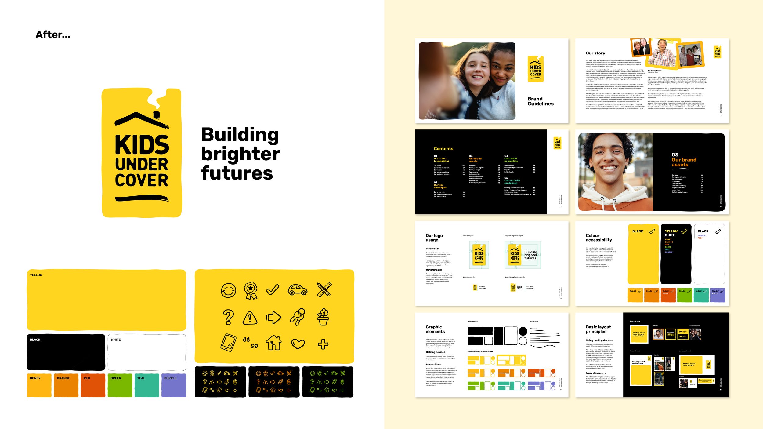
Following our work developing the Kids Under Cover brand foundations, we were asked to optimise the brand identity and guidelines.
The brand was being applied inconsistently and across different touchpoints due to minimal guidance around colour use, fonts, iconography, photography and other visual and tonal brand assets. The logo and core colours (black, yellow and white) were important identifiers for the brand, and needed to be built on - not replaced.
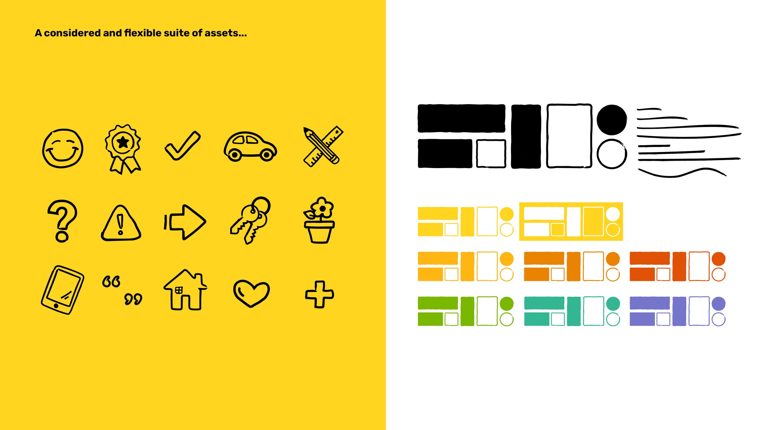
We reviewed and simplified the existing brand assets by developing clear logo usage rules, and updating the brand font and primary and secondary colours for consistency and stronger engagement. We then developed and applied a new tagline, optimised imagery style, and created a new suite of illustrative icon assets for a more recognisable and contemporary brand.